Maybe you are a new entrepreneur, just launching your company and ready to set the interwebs a’fire with your new ideas … or maybe you’ve been around a bit and are just realizing how a creative logo design can make a difference in your brand marketing. Either way, you know you need to redesign and you are wondering how to get started.
First of all, think about some of the most famous brands you know … McDonald’s, Chanel, Mercedes-Benz … what do these companies have in common? A strong logo… instant brand recognition ... an image that inspires trust. McDonald’s arches, Chanel’s double C and the Mercedes-Benz circle and three-pointed star have all of the qualities of a creatively designed logo. Even if you are a small business and international fame isn’t in your immediate future, the principles are the same. Here are three logo design tips to consider when creating your company logo.
1. Keep It Simple Many of the world’s most recognized logos are, above all else, simple. An intricate logo with swirls, shadows, lines and circles will only clutter your logo and thus, your brand. While you are at it, leave out the secret codes. A logo filled with metaphors and hidden meanings might be interesting to you as your company’s CEO, but will have little meaning for your potential clients.
A complicated logo will only clutter your business card, website or letterhead and will make it difficult for your clients to recognize or remember. Bringing us to point number two …
2. Make it Memorable In addition to simplicity, creatively designed logos are memorable and create instant brand name recognition. This is especially important for web businesses that have less than five seconds to attract readers, make a positive impression and keep them engaged long enough to either continue navigating their site or make a purchase.
Other times, a company logo is the only element a potential customer has to see, evaluate and make a judgment about your company, particularly in print yellow page advertisements or in small web-sized ads.
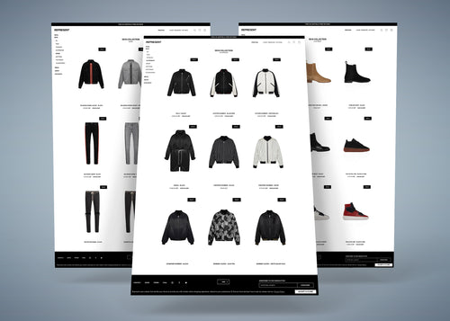
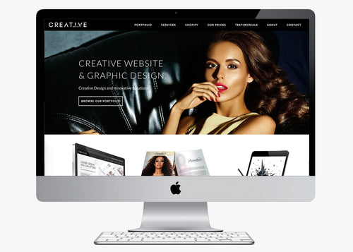
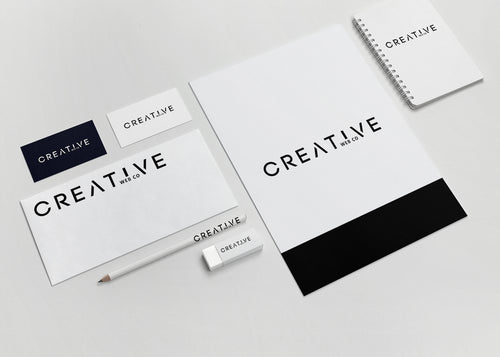
3. Fully Functioning In addition to being simple and memorable, your company logo has to be functional. You will use it on sales material, web designs, business cards, letterhead and print ads and you will need it in different sizes and colours.
You logo will need to look good, not only in the simple colours you used in its design, but also in black and white-for fax or copied materials and resized for business cards, giveaways-such as key chains, stress balls or ballpoint pens-and web-only designs where space might be limited. Your logo will be seen on light backgrounds and on dark backgrounds, on small print material, on full-page designs and it will need to be able to look professional and creative in all of these mediums.
If your logo includes a small text tagline beneath the main graphic, that line could be lost when your logo is resized, making it illegible and unprofessional. Additionally, a coloured logo could look blurry on a black and white fax or be ill-suited to a different coloured t-shirt.
If you are unsure of where to get started, our creative graphic design specialists can help. They can guide you through the process, answer any questions you have and help ensure your one-of-a-kind logo is simple, memorable, functional and above all else, fabulous. Get in contact for advice and a FREE quotation.
Subscribe
Sign up to get the latest website advice, business tips more …